What Is Your Dashboard and How Does it Work?
View the video tutorial at https://youtu.be/fPkIyqLj3mk.
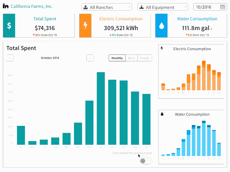
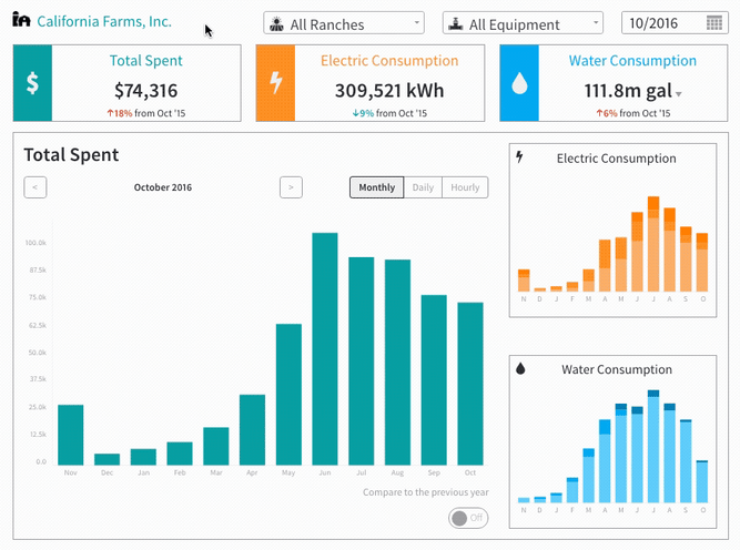
When you log into the Wexus platform, the first thing you see is your Farm Dashboard. All historical data for at least the last 12 months from your utility bills, energy meters, and connected digital flow meters are compiled into the platform along with your farm's ranch names, equipment names and building names that are tied to a utility meter. This can help you quickly identify billing and usage trends or anomalies across your operation and takes the pain and guess work out of manually sifting through paper bills.
You can change the date range of the data displayed by clicking on the Calendar icon in the upper right hand corner. Below the date selector, you'll see a snapshot of the total expenditure and electric and water consumption for the current month as well as three charts showing spend and usage over the last 12 months. When you hover over a bar in the large chart, you will be able to see the value the bar represents. In the "water and electricity charts," the data is further broken down to reveal not only total usage, but how much was used during off-peak, partial-peak, and on-peak times of day. Clicking on the small charts will expand them.
Compare to Previous Year
To view trends, click on the button labeled "Compare to Previous Year." By toggling the button on, the chart will display not only the last 12 months of data but also, a side by side comparison of your current month's data to that of the same month in the previous year. This is an excellent tool for charting habits and changes in costs.
Navigating Through the Dashboard
When you first log into the Wexus platform, the dashboard will load company data into the Snapshot and Charts. This will include data for all equipment at every ranch on your farm. If you want to look at a specific ranch or piece of equipment, use the drop down menus above the charts. Once you have selected the ranch or equipment you want to view, the data will change to reflect the desired information.
Reading the Pump Efficiency chart
This chart is broken down into three sections. The green, upper section, represents 60% to 100% pump efficiency. This section is ideal and indicates your pump is working effortlessly. The middle, yellow section, represents a 50% to 59% pump efficiency. If your pump is operating at this level, some maintenance may be required. The red section represents 0% to 49%, if your pump's efficiency falls into this category it is indicative of a probable pump failure and should be addressed quickly.
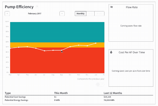
Pump efficiency calculations
A common question is, "How do we calculate pump efficiency?" Similar to pump test reports, Wexus calculates pump efficiency using an industry standard equation with several variables: total dynamic lift, water flow rate, discharge pressure, and energy usage (which is the same equation used by the Advanced Pump Efficiency Program at Fresno State). Unlike pump test reports, Wexus also remotely tracks real-time data from your normal irrigation operations. This provides you with a more accurate and up-to-date pump health status report.
In addition to calculating pump efficiency, we also project the potential cost and energy savings if you were to increase your pump's efficiency from it's current rating to at least 60%. This helps you better understand the potential impact of an energy efficiency investment of conducting scheduled maintenance, upgrading or replacing a pump, installing variable frequency drives (VFDs), or impacts to changes in well depths/aquifer levels.
How Can I Sign Up for a Free Demo with My Data?
If you’d like more information about how Wexus’ software platform can drive efficiency across your farming operation, click here to sign up for a free demo or email us at info@wexusapp.com.